
|
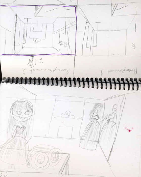
both of these photos are of my sketch notebook. I personally believe that they do not have to be neat, as long as you can understand them yourself. Both of these are the beginnings of the project below, which is in colored pencil. It starts off with a quote that inspired the project, along with the criteria. Then it moves on to tell you what type of references I need to find and a quick sketch of the piece. further down it tells of my actual references. , and a few sketches that I did for fun. On the second page it show how I plays with the placement and perspective. And finally it finishes off with the final placement.
This whole project was inspired by a music video by POD, beautiful. I took one aspect from the video of importance and incorporated it into my art work. The goggles were the point of focus but for me I did not want that to e the mail point. Instead I positioned then to point to the girl in the back facing the mirror. link to POD's music video: http://www.youtube.com/watch?v=Wquq4DTbC9E |
|

|
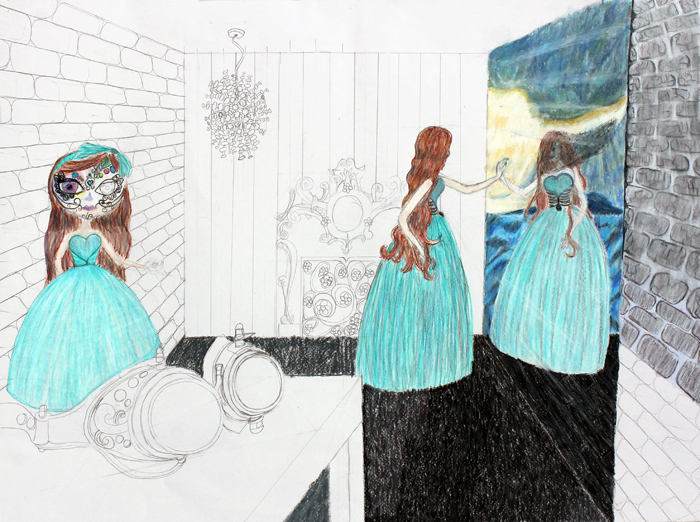
This is a photo of the underlining drawing of the piece. the main difficulty was the perspective of the brick work to the left and right of the paper. other then it was simple adding the details to the characters and background.
|
|
The color was added in layers from the lightest to the darkest. I used a formal that I owned as reference for both dressed while altering it to portray each character.
Instead of using the reflection of the room in the mirror I decided to use an alternate background in perspective. I thought the stormy sea with sights of sunlight at sunset would make the piece more whimsical to the viewer. |
|
|
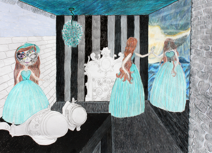
Going further in to the coloring process, I decided to bring more darker blues into the ceiling to add contrast and bring the sea into the work. Along with that I added vertical lined wallpaper in the background to offset the perspective brickwork to make the piece seem stable to the eye. I also added a lighter color around the table to create a contrast between it and the floor or carpet.
|
|
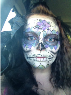
This makeup was inspired from the sugar skulls of Day of the Dead. It was done for a Halloween dance for my youth group, Job's Daughters, which I initially had to plan and put the event together. More on that later. I used several reference photos as well as prior knowledge of the Mexican holiday. starting with a white eyeliner by Wet & Wild I outlined the eye sockets and then filled in my entire face with the same pencil. I then padded on correcting powder by elf to make the makeup last all night. Using a black wet & wild eyeliner pencil I outlined my cheeks, mouth, and eyes. I then added Purple, blue, and black eye shadow to add depth to the eyes. I found a fluffy brush and contoured my cheeks, jaw, and forehead with black eye shadow. I also took purple and blue gel eyeliner to draw on the flowers around my eyes, and on my forehead. Finishing off the base colors I added green to my chin. I added smaller details with liquid eyeliner on the flowers, forehead, and chin, along with the teeth. Finally I toped it all off with glitter, false lashes, and stick it spray.

|
This was a piece that I composed using reference photos as a Christmas present for a close Friend. I chose to base it off of a web comic that we both enjoy reading, Homestuck. With many comics and series comes the activity of "Shipping", which is one of her hobbies. Shipping is when a person thinks two characters or people should become a couple. I really wanted to show the characteristics of the characters in the piece. The one in Blue, Nepeta, Is a playful, caring, and childish character. While the one in black, Karat, is usually cranky, and just plain out mad at the world, But He has moments where he has a soft spot. |
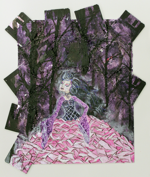
For this term in art I was given an assignment. This assignment was to work around a theme, which it was memories. The first ideas were mainly Clichés, such as sitting on my grandpa's lap, of learning a skill. I eventually thought of and idea that I tried to stick with. I remember hearing all of these stories of people having memories they can not explain. These are sometimes concluded as past lives. It seemed like a brilliant and doable concept when I first began. Underneath the painting I placed floppy disks, which represent memory. Each disk represented a memories. Early on in the planning process I realized my painting would be too busy with each historical event, eleven to be exact, so I changed my concept. I started to do research of how we create and remember things. Every memory that we have is built off of what we already have. Later I watched music video by Avril Lavigne, When You're Gone, and as I remembered things I took aspects from them to create my finished work. I uses crackle past to blend in the disks and also show how our memories are incomplete. One of the requirements was to pick a property of art for your piece, chose emphasis. This was achieved by playing with my color palette, mainly on the girl. Her color palette is lighter which draws the eye. I also used irreverent ink on the skirt and as the halo to separate her from the dark forest back ground. The girl represents our happy memories and the forest our darker. No mater how much we focuses on out happiest memories our worst are always in the background, which is why she is crying.
